Family Dashboard: Weather, Glucose, and More in 64x64 Pixels
January 18, 2026
I built a family dashboard on a 64×64 LED matrix. It shows time, weather, and glucose readings. Serverless AWS backend, $4/month of AWS to run, developed entirely with Claude Code. The display is always on, always current.
My daughter Abigail has Type 1 diabetes. Living with T1D means checking glucose numbers constantly. All our phones have widgets charting readings every 5 minutes from her Dexcom G7 continuous glucose monitor. We check. A lot. The numbers matter, and the trend between numbers can matter even more. Is she rising? Falling? Holding steady?
Phones are great tools. I can’t imagine managing diabetes without them. But it’s also great to have something visible at a glance when we’re at home. Something we can check without pulling out our phones.
SugarPixel
Courtney found SugarPixel. We love it. We have several at home and set up a few more at Abigail’s school. Highly recommend if you’re managing diabetes.
![]()
SugarPixel is a small LED display that shows glucose, trend arrows, and the delta from the last reading. Color-coded by range: red for lows, green for in-range, yellow and orange for highs. It connects to Dexcom’s servers and updates automatically. Glanceable. Always on. No phone required. It doesn’t show trend history, but it’s still our primary CGM monitor.
We even travel with one, paired with a GL.iNet Puli portable 4G router so it stays connected anywhere. The setup works well enough that it deserves its own post sometime.
But SugarPixel sparked an idea. What if we could have one with trend history? Or data for other parts of our life—weather, calendar, notifications? How fun would that be to build?
Failed Starts and Found Solutions
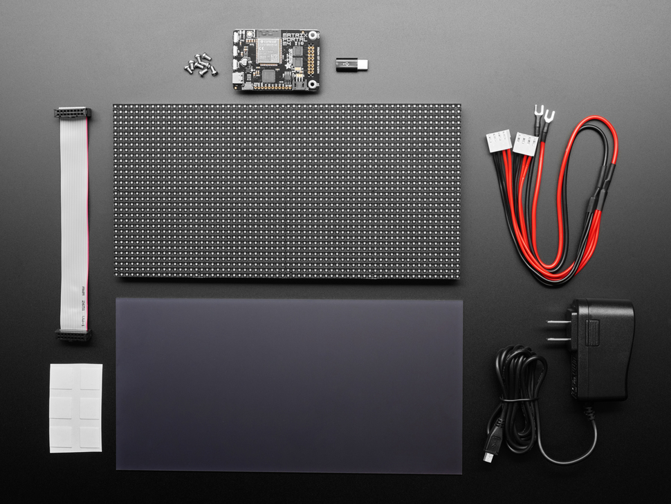
I’d tried building an LED dashboard before. I bought an Adafruit 64x64 RGB LED Matrix, figured I’d wire it up and write some code. The hardware setup was a pain. Power supplies, driver boards, level shifters. The controller needed tons of setup just to get on wifi. I wanted to write software, not debug electronics.
Then Aaron Patterson posted about the Pixoo64.
I’ve admired Aaron’s work for years. He’s a Ruby core committer who makes everything look fun. His blog, tenderlovemaking.com, is a mix of deep technical posts and playful projects.
He recently wrote about building a Ruby client for the Pixoo64. The Pixoo64 is a 64×64 LED matrix from Divoom with WiFi and an HTTP API. He uses it to display PM2.5 and CO2 levels in his office. “I learned that I need to open a window,” he wrote.
The Divoom handles everything I didn’t want to DIY: packaging, networking, power, display API. I just write software and push pixels over HTTP.
I set out to build a dashboard. Serverless, running on native AWS services. A multi-widget architecture where each data source lives independently. Minimal maintenance, bias for reliability. Developed entirely with Claude Code. Deployed through GitHub Actions. A pattern I love.
Cloud to Countertop
The Pixoo sits on my home network, behind NAT. I can’t push to it directly from the cloud. The device needs to pull, or something local needs to relay.
The solution: a serverless AWS backend that holds the glucose data, and a small relay running on my home network that pulls updates and pushes them to the Pixoo’s HTTP API.
Lambda functions fetch glucose readings from Dexcom. A WebSocket connection lets the relay subscribe to updates. When new data arrives, the relay renders it to the display. The whole thing runs for pennies a month. No server to maintain.
The Stack
SST v3 handles all the infrastructure as code. AWS provides the pieces: Lambda, API Gateway WebSocket, DynamoDB, EventBridge for scheduling, CloudFront for the web emulator. TypeScript everywhere, organized into packages for the core logic, Lambda functions, the relay, and a web interface. Monorepo with pnpm workspaces.
The architecture uses a compositor pattern. Each widget (glucose, clock, weather) publishes its data independently to SNS. A compositor Lambda combines them into a single 64×64 frame whenever anything changes. The relay doesn’t know about widgets. It just receives pixels.
The web emulator was a late addition. Testing display layouts without physical hardware made iteration much faster.
Always On
The relay needs to run constantly. I could leave my dev machine on, but that was bound to be unreliable and wasteful for a single WebSocket connection.
Once I got everything working locally, I deployed the relay to a $3.50/month AWS Lightsail nano instance. The catch: the Pixoo is on my home network, and Lightsail can’t reach it directly. The solution: WireGuard. The Lightsail instance tunnels into my home network through a VPN. It was easy to set up on my router, a Ubiquiti Dream Machine. The Pixoo thinks it’s talking to something local. The cloud thinks it’s pushing to the internet. Everyone’s happy.
The relay runs as a systemd service with automatic restart. If the WebSocket drops, exponential backoff with jitter spreads out reconnection attempts. Keepalive pings every five minutes prevent idle disconnects. The service won’t start until the WireGuard tunnel is up. It’s been running for days without intervention.
Total cost: about $4/month for Lambda, DynamoDB, and the Lightsail relay. Cheaper and easier than leaving a computer running.
Built With Claude Code
I built this with Claude Code. The pairing made everything fast and fun. Claude handled the SST wiring, the Dexcom API integration, the WebSocket handshake, the binary protocol for pushing pixels to the display. I described what I wanted, Claude wrote the code, I tested and refined.
The worktree-based workflow helped too. Multiple branches in flight, each focused on a different piece: the Lambda functions, the relay, the display rendering. Claude could context-switch between them.
This project came together in a weekend.
Reading the Dexcom
Dexcom’s Share API is how followers receive glucose data. The same data that shows up on the Follow app. The system fetches the latest reading every minute, though Dexcom only pushes new values every five minutes.
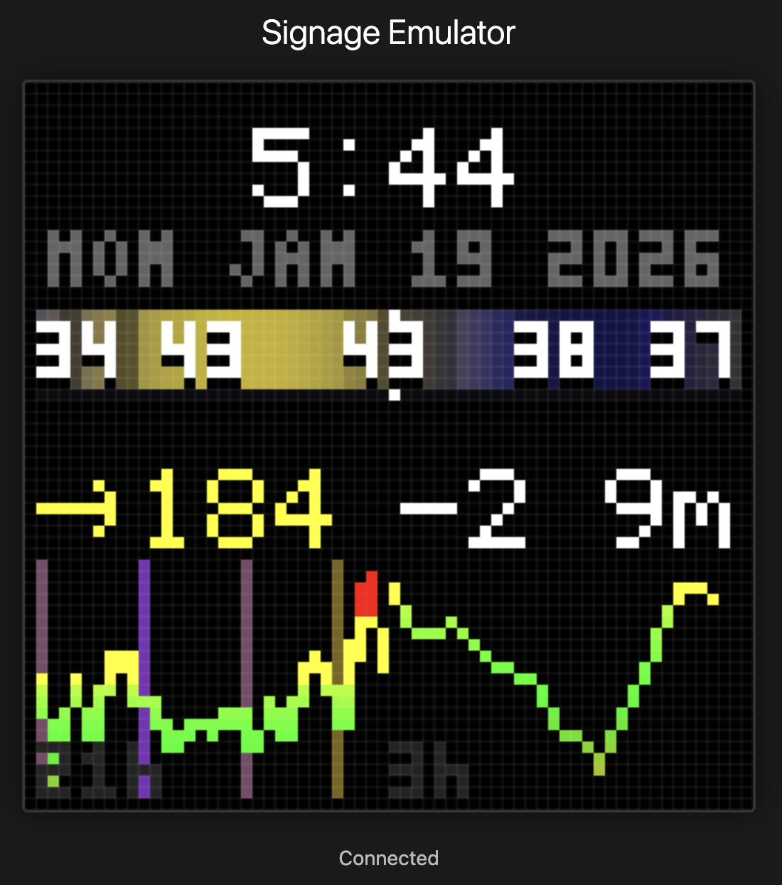
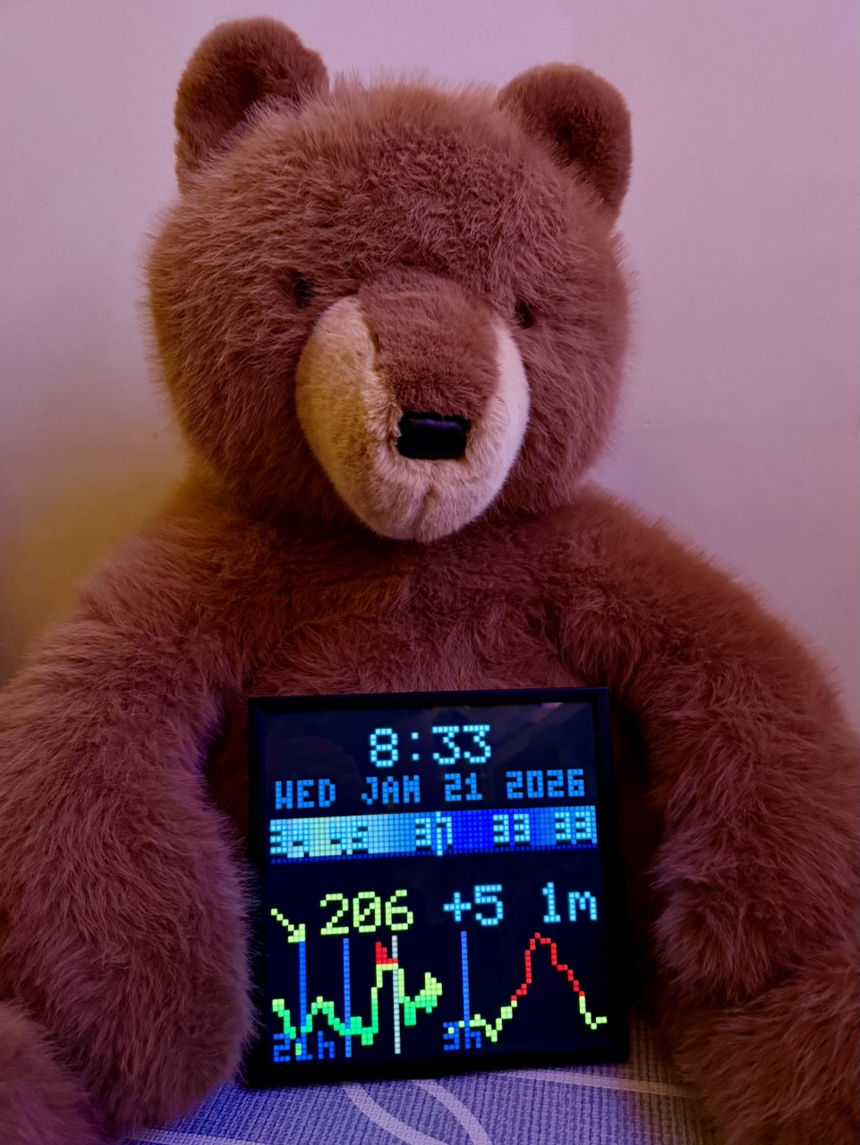
The display shows the glucose value, a trend arrow, and the delta from the previous reading. Color-coded the same way SugarPixel does it: red below 70, green between 70 and 180, yellow up to 250, orange above that. The visual language is familiar. Anyone in the family can read it at a glance.
Patterns Over Time
Once the glucose number was working, I wanted trend data. SugarPixel shows the current reading. I wanted to see patterns at a glance.
I added a sparkline chart. But 24 hours of data compressed into 64 pixels loses detail. The last few hours matter most for decision-making: is she trending up from lunch? Coming down from a correction? So I split the chart in half. The left side shows 21 hours of compressed history. The right side shows the last 3 hours in detail. Recent data gets more pixels.
To do this I had to keep state. DynamoDB stores historical readings with automatic TTL cleanup. Every minute the compositor fetches 24 hours of history and renders both charts side by side.
I added vertical time markers at midnight, 6am, noon, and 6pm. Color-coded with a gradient from purple at night to yellow at midday. At a glance I can see when different readings happened. After-lunch highs are common with T1D. Now I can see them in context. The pattern matters as much as the number.
Weather Band
Same idea, different data. I built a weather band showing temperature and conditions across 24 hours: 12 hours trailing, 12 hours forward. The center is now. A gradient shows daylight levels using the same purple-to-yellow curve as the glucose chart. Cloud cover dims the band. Rain adds a blue tint. Temperature numbers overlay at key points.
Glancing at the display, I can see where the weather is going relative to where it was. Warmer tomorrow. Rain coming this afternoon. The same ambient information principle: no interaction required, just a glance.
A Family Dashboard
Glucose is the starting point, not the whole vision. A 64×64 grid has room for more.
The next addition: Oura Ring readiness scores. Courtney and I both wear Ouras. It’d be fun to have the top corner show our readiness scores, color-coded by how recovered we are. Two health metrics from two different sources, one glanceable display.
Then maybe more weather, calendar events, or a doorbell notification. Multiple data sources, composed onto one display. Perhaps other Pixoos in other rooms, each showing a different mix. The kitchen gets glucose and weather. The office gets calendar and glucose.
Open Source
I’ve open-sourced it on GitHub.
Ambient displays change how you interact with information. Or rather, how you don’t interact. The best interface is no interface. Just information, always visible, waiting for a glance.
Update: Part 2 adds insulin tracking and pump integration.
– John